Quote Request

Please fill in your details below in order for us to assist with your quote request.
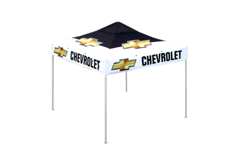
Message:


Can't read the image? click here to refresh

×

Marketing Gazebo

Use Clever Graphic Design to Make your Marketing Gazebos more Effective

The use of gazebos, banners, and flags is becoming more prominent now than ever. The reason for this is that they make your brand stand out. While being a very cost-effective way to announce the presence of your brand, they become even more useful if the design of the graphics on your marketing gazebos, banners, and canvas prints is vivid and eye-catching. But it does not stop there. Yes, you need to stand out and be noticed, but it should not be for all the wrong reasons, and end up detracting from the identity of your brand. It is essential that the design of the graphics for your marketing materials and gazebos truly represents the identity of the brand, and there are a lot of things you can use to effectively bring your brand message across to the audience:


marketing gazebo
To get a quote:
  • Use contrast: Over the last decade or so, design techniques have evolved to make smart and innovative use of colour and contrast. No longer is it just about bouncing a few colours off against each other. Contrast can be used effectively in thin lines or the creation of boundaries between similar colours. The true graphic artist knows that applying colour to marketing gazebos, banners, flags, or graphic prints is a lot like applying make-up. The parts you want to be noticed have to be contrasted with the parts that should not be as noticeable.
  • Gradient: Less is often more when it comes to gradient colours, and subtlety and moderation create fresh, flowing designs that stands out. The logo and other text should incorporate very soft gradient variations to emphasize what they are trying to convey. Working with gradients can be tricky and it is important to maintain the visual flow. Therefore, gradients should be used sparingly and subtly.
  • Text and font: Gaudy fonts are a taboo if they do not contribute to the design and are at odds with the corporate identity. Fonts should be clean and easy to read, especially when using them for marketing gazebos or banners. Because gazebos stand out above the crowd, they should be recognisable without being chaotic, causing the meaning of the text to get lost in the design with a font that does not lend itself to easy visual interpretation. Bin the Times New Roman!
  • Colours: Using bright colours can work well, but they should be used in context. People attach different emotions to different colours, and for a traditional company to use too outlandish colour combinations will detract from the identity and sobriety of the brand. Modern and very progressive companies, on the other hand, can use trendy design with opposing colours, but sparingly. The use of colour has to say something about the brand and its goals, and this makes it all the more appealing to the target market.
If you are looking for designers with flair and talent to design some wonderful marketing gazebos, banners, and flags for you, just call our team at Portable Shade. We specialise in the creation of quality design and outstanding value for money when it comes to making your brand more visible. Give us a call today to find out more.